


Get started with map by squillion today!
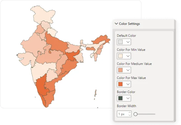
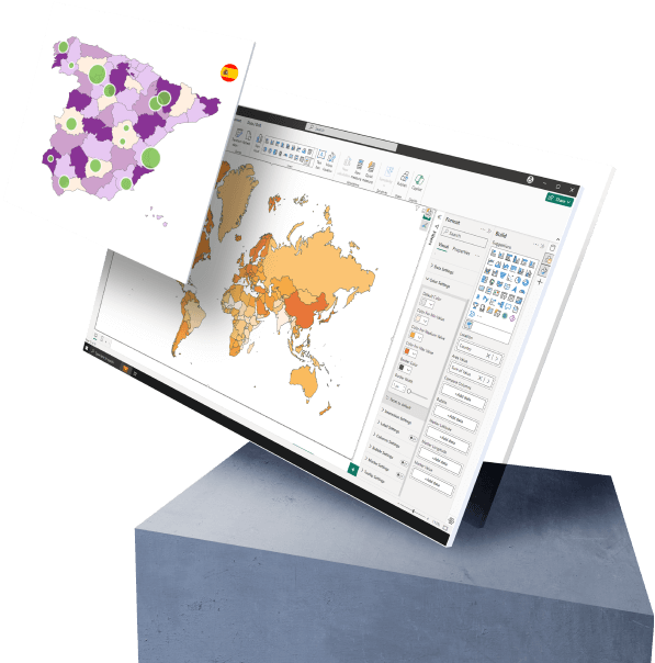
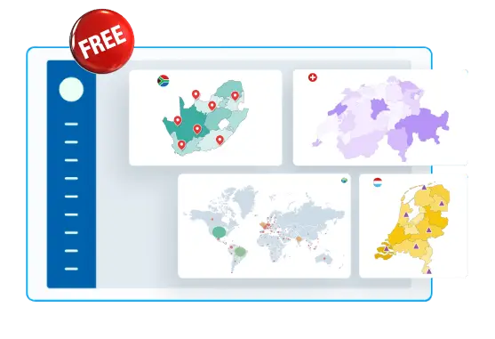
Add and Explore Map by Squillion’s set of features. Make your report visually rich.- Choropleth Coloring
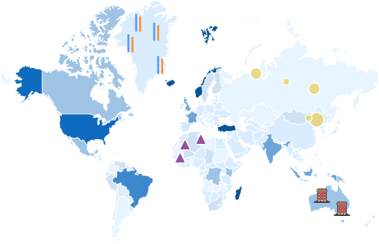
- Area Bubbles
- Location Markers
- Area Labels
- Dynamic Interaction
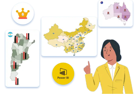
Premium Features for an Enhanced Experience!
Unlock the full potential of your data visualizations with the Premium version of Map by Squillion. Elevate your reports, captivate your audience, and unlock new insights that drive success.- Watermark Removal
- Custom Location Markers
- Comparison Columns